You snap a stunning sunset on your phone. The sky glows orange. Waves crash just right. But back home, the photo looks crooked and cluttered. Distracting branches poke in from the sides. The horizon tilts.
Most snapshots suffer this fate. They start strong but end flat. Basic adjustments improve most photos with simple sliders. No pro skills needed. You can fix crop and straighten, exposure, contrast, highlights and shadows, white balance, plus clarity or vibrance. These tweaks work in free apps like Snapseed or Lightroom mobile.
Grab a photo on your phone now. Follow these steps. You’ll see pro results fast.
Crop and Straighten to Frame Your Best Shot
Bad framing pulls eyes away from your subject. Junk in the edges makes shots feel busy. A tight crop fixes that. It spotlights what matters.
Start with the rule of thirds. Picture a tic-tac-toe grid on your screen. Place key elements along lines or at crosses. This creates balance. Your viewer follows naturally.
Open any editor. Pick the crop tool first. Drag corners to cut distractions. Slide the level line for straight horizons. Check the grid overlay. Turn it on in most apps.
Think of a beach shot. Left side shows trash bins and feet in frame. Right side focuses on rolling waves. Horizon levels out. The scene breathes.
Zoom out after cropping. Does it balance? Avoid chopping too much. You lose context fast.
Many phone apps show grids. Lightroom’s crop panel shines here. Practice on vacation pics. You’ll frame better next time.

For a hands-on breakdown, check this practical guide to rule of thirds. It shows real examples.
Crop sets the stage. Next, lighting tweaks bring it alive. Small slides make big changes.
Fix Lighting to Make Every Photo Shine Bright
Dull lighting ruins 80 percent of photos. Faces hide in shadows. Skies wash out white. Sliders rescue that fast. Start small. Toggle before and after views. Manual beats auto for control.
Phone editors pack these tools. So does Lightroom. Adjust in order. Build from base brightness.
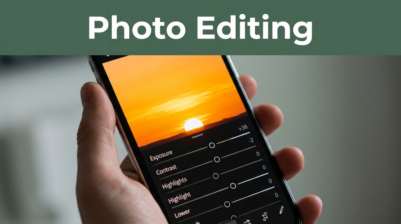
Adjust Exposure for the Perfect Brightness Level
Exposure sets overall light. Dark shots look moody by accident. Bright ones lose punch.
Find the slider. Slide right to brighten underexposed pics. Pull left for overblown ones. Aim for what your eyes saw.
Take an indoor portrait. Faces dim under lamps. Slide up 0.5 stops. Skin glows natural. Details pop.
Don’t crank it. Pair with other fixes. Overexposure clips highlights forever.
Lightroom’s basic panel leads here. Phone light tools mimic it.

Exposure evens the field. Contrast adds shape next.
Boost Contrast to Add Pop and Depth
Flat tones bore viewers. Contrast separates lights from darks. It adds dimension.
Slide it up 20 percent first. Brights get punchier. Darks deepen. Scenes gain life.
A foggy landscape drags. Boost contrast. Hills emerge. Sky holds weight. Drama builds without fakes.
Cameras even out tones too much. This fights back. Still, cap at 40 percent. More looks cartoonish.
All apps handle it the same. Test on overcast days.

Contrast works best after exposure. Now recover lost spots.
Pull Back Highlights and Lift Shadows for Hidden Details
Cameras clip extremes. Bright skies go blank. Shadows swallow faces.
Drag highlights down. Tame those whites. Slide shadows up. Pull details from blacks.
Sunny portrait muddies. Face sharpens. Clouds form. Balance returns.
In 2026, phone apps add subtle masks. Target subjects only. Keeps skies real.
This stays natural. No re-shoots needed.

Lighting solid now. Colors come next for true feel.
Tune Colors So Your Photos Look Real and Vibrant
Off colors kill mood. Bulbs tint yellow. Shade turns blue. White balance fixes casts. Vibrance and clarity boost life without excess.
Group them here. Both restore reality. Eye dropper or sliders work. Skip heavy saturation. It screams fake.
Tune after lighting. Base needs set first.
Set White Balance to Ditch Yellow or Blue Casts
Light sources vary. Indoor shots glow orange. Outdoor shade cools blue.
Use temperature slider. Orange warms bulbs. Blue cools shade. Tint handles green or magenta.
Indoor pic oranges up. Slide to daylight. Skin tones freshen. Room pops true.
Phone autos start good. Tweak manual. Lightroom’s tool simplifies it.

White balance grounds colors. Finish with texture.
Add Clarity and Vibrance for Crisp, Lively Results
Flat shots lack bite. Clarity sharpens midtones. Leaves crunch. Petals define.
Vibrance lifts muted hues. Skin warms. Flowers bloom. No wild overshoot.
Boost clarity 20 percent. Vibrance 15. Flat bloom turns vivid garden shot.
In 2026, AI vibrance tempts. Manual stays subtle. Wins for natural looks.
Small doses shine.

Follow This Order and Use the Right Tools in 2026
Order matters. Crop first. Then exposure, contrast, highlights and shadows, white balance. Clarity last.
Base shapes guide fine work. Random tweaks muddy results.
Zoom out often. Save originals. Practice junk shots.
Tools abound. Lightroom mobile rules basics. Check this complete Lightroom mobile guide. Free Snapseed packs sliders too.
In March 2026, trends favor natural edits. Film looks warm soft. AI handles grunt work. Manual controls basics best.
Free apps top lists. Snapseed, Pixlr shine for beginners. See best free photo editing apps for 2026.
These steps turn snapshots pro. Phone power matches desktops now.
Basic adjustments improve most photos every time. Practice builds speed. Your okay shots become keepers.
Try these on three pics today. Share before and afters in comments. What changed most for you?
Subscribe for weekly tips. Pin this for your next edit. You’ve got pro tools in your pocket.